Case study
Luxury Mall Website Revamp
What if the digital experience of your website matched the luxurious in-person vibe of your mall?
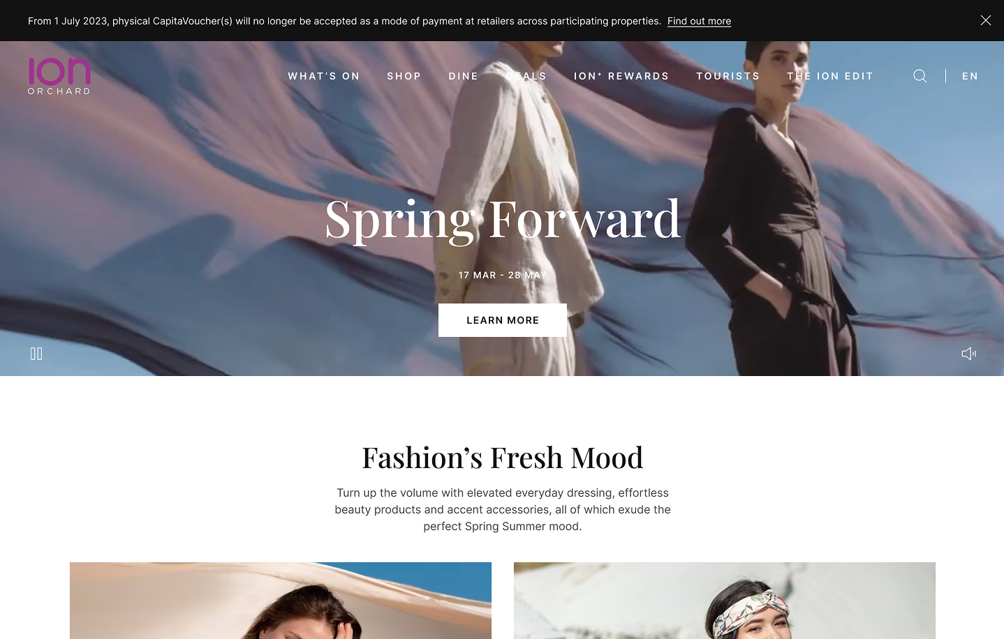
The challenge
This popular mall wanted to revamp their website, in order to cater to their different audiences, and to create a more luxurious feel—both in terms of brand and aesthetics, as well as user experience.
The process
Discover & Define
- Visioning workshop
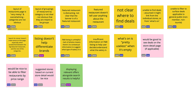
- Corridor tests:
- Usability test
- Card sort
Design & Deliver
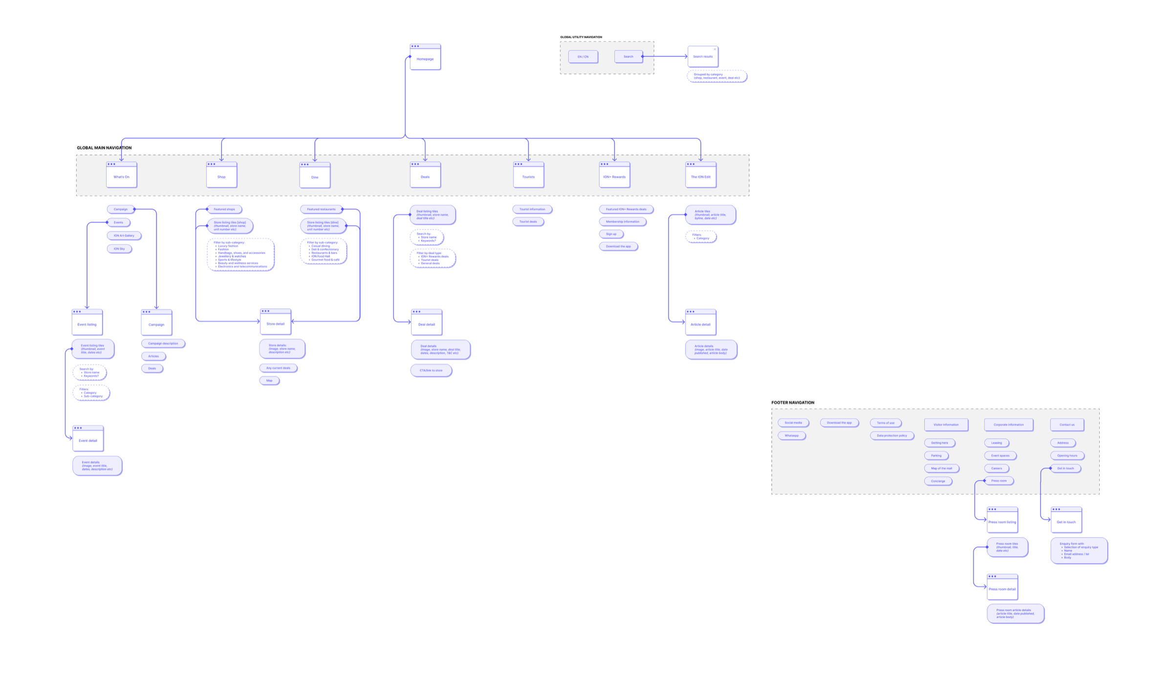
- Information architecture
- Wireframes
- Design sprints
1 · Discover & Define
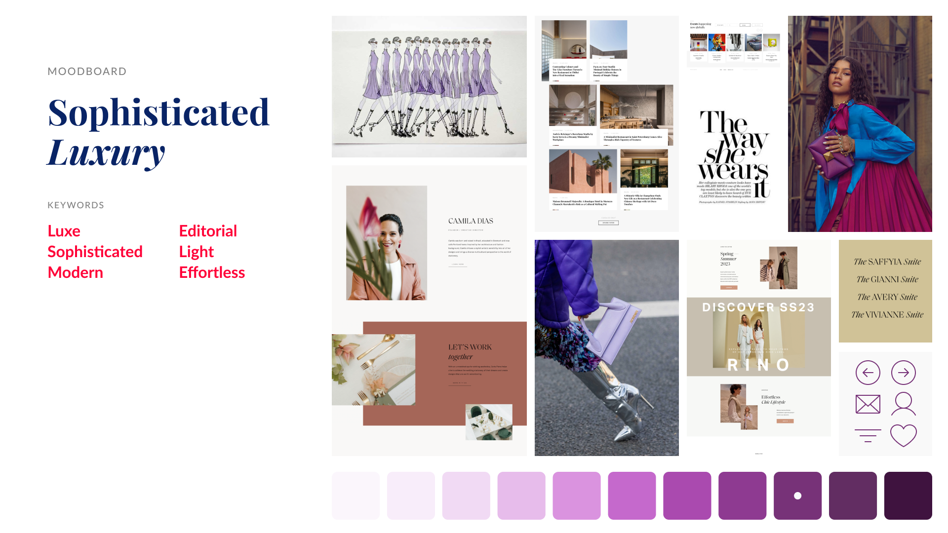
We began the project with a visioning workshop, where we pulled together inspiration from other luxury malls’ websites in order to land on a clear, cohesive idea of what “luxury” truly looked like, both from a look-and-feel perspective, and in terms of user interactions and digital experience. From here, we were able to build a design system and library to guide the website design.
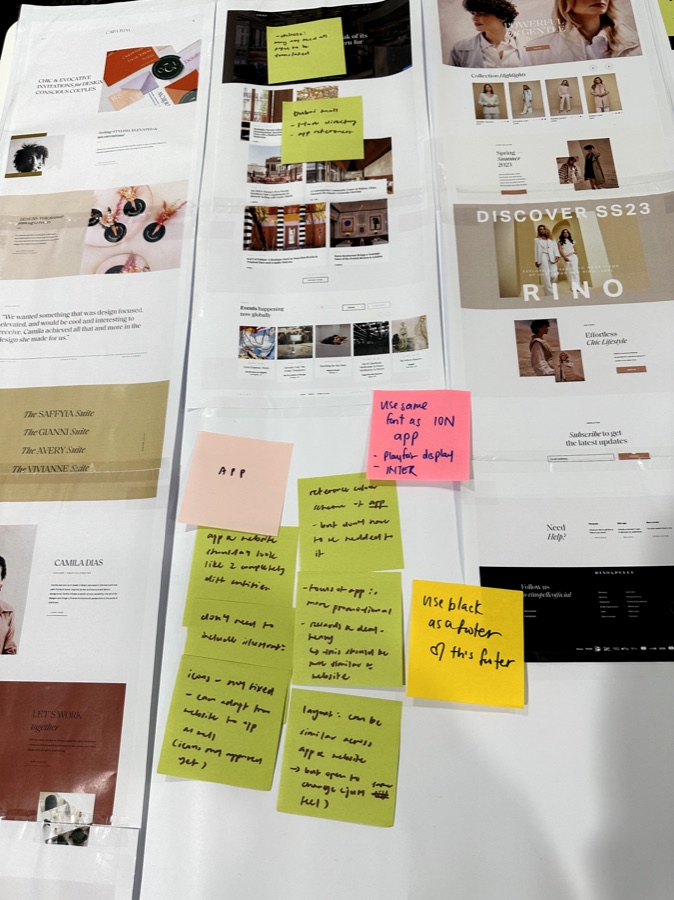
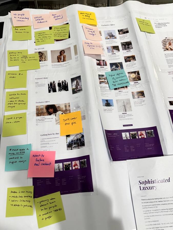
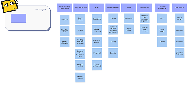
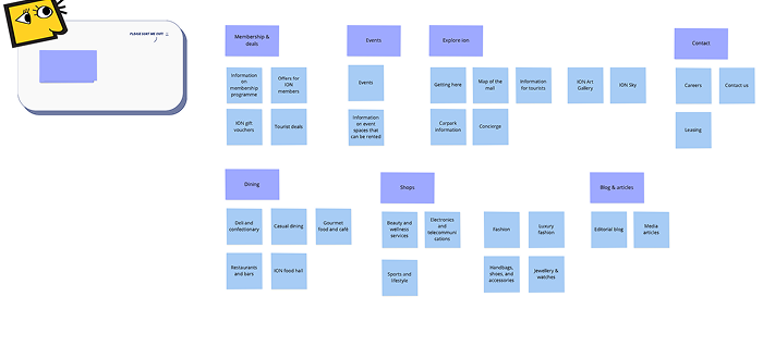
In tandem, I carried out corridor usability testing and card sort exercises in order to redesign and improve the website’s information architecture. With this new IA, we then had visibility over the number of unique templates we needed to design across all the website’s pages, which I then planned across five design sprints.
2 · Design & Deliver
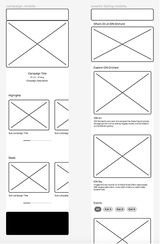
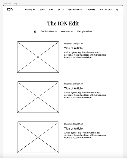
In preparation for each sprint, I created wireframes for each of the pages we were tackling based on the client’s current website, coupled with my research on best practices, taking particular inspiration from websites of other luxury malls, as well as those of tourist attractions (since this mall also catered strongly to tourists).
This enabled us to talk through the requirements for each page with the project stakeholders in a tangible way at the start of each design sprint. The development team was also included in these conversations, which enabled them to raise any backend considerations and questions as well.
We concluded each sprint with a design showcase, where we got feedback from the project stakeholders which we used to iterate on the designs.
The upshot
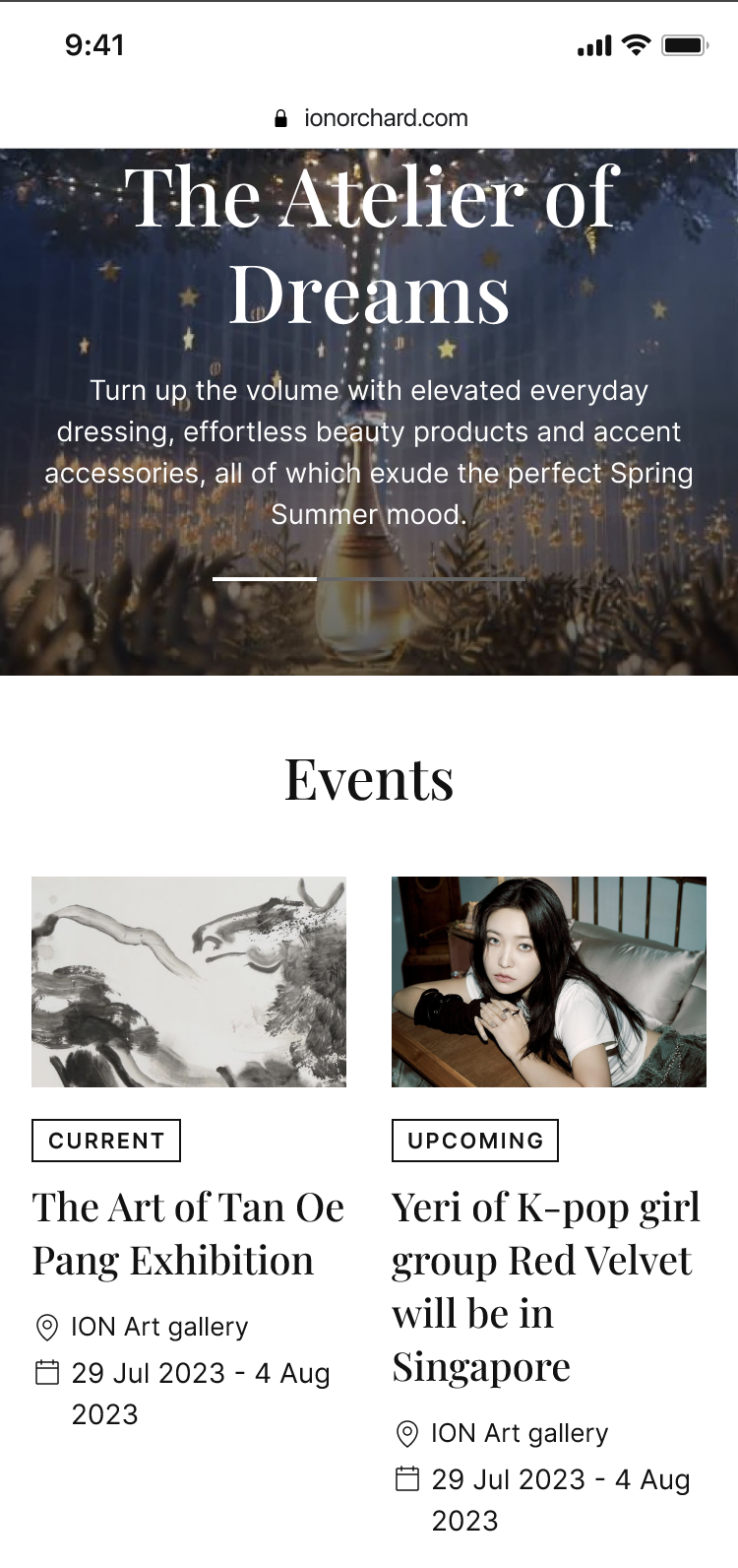
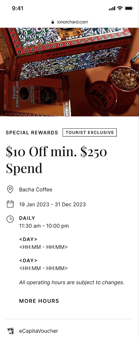
We delivered 20 screens across web and mobile, with annotations and documentation to enable the dev team to execute. The revamped site launched in 2024.
Little learnings
It was very eye-opening and interesting that the primary team we were working with was the marketing team, who provided a very strong point of view in terms of aesthetic design and marketing KPIs. Having to bridge both these perspectives without sacrificing usability and user experience was a nice challenge that pushed me to think more creatively.